Graphs are a set of numerical facts that enables the viewer to make comparisons and draw quick conclusions. The various types of graphs include: line graphs, bar graphs, pictographs, circle graphs and formula graphs.
The Horizontal Line is known as the x axis.
The Vertical Line is known as the y axis.
1. Line Graphs
Line graphs present data visually and is a way of expressing the relationship between two variables. The variable is marked out on a linear scale along the bottom of the graph. The variable is marked out on a vertical scale along the left side of the graph, it is usually linear and may or may not start from zero.
2. How to Construct a Line Graph

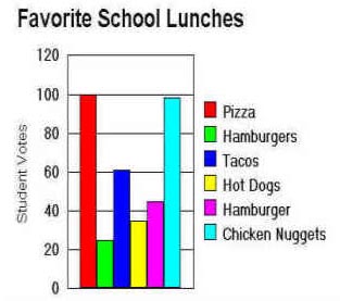
A Bar Graph is a visual presentation of one set of facts in relation to another set of facts. There is the same horizontal line (abscissa) representing one set of facts. The same vertical line (ordinate) represents the other set.
For a bar graph, you do not connect the points by line, you make bars of equal width which you draw to a point to show the relationship. Through inspection, it is possible to see which bars are higher and represent a larger percentage.
Circle Graphs are divided into sectors. Each sector is a proportional part of the whole circle. The first thing to notice on a circle graph is the labels, which indicate what each section represents. A complete revolution is divided into 360o. If we wish to mark off one-quarter of the circle, the angle at the centre must be Ľ x 360o. A circle with an angle at the centre will be 60o or 80/360 or 1/6 of the circle.
A circle graph is used to show the relationship of each variable to other variables. It shows the overall picture.

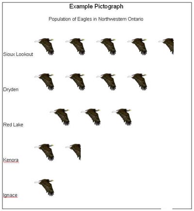
5. Pictographs
A Pictograph is a graph in which objects are used to represent numbers.